THE REAPPEARING ACT goes on sale May 6. But if you order through Amazon, it will ship immediately.
I would love to hear which of the above cover options -- Design No. 1 through No. 10 (left to right) -- you think is best. Hit me with an @-mention on Twitter: @katefagan3.
Like most authors, I was preoccupied with the cover design for my book. Part of that obsession was about distraction, about focusing on a part of the book that had nothing to do with writing. It's sort of like when you're a basketball player and you get tired of your own training, so one day you just go kick a soccer ball around, and you feel like a kid again. Oh, yeah, this is supposed to be fun!
Also, I've always believed cover design is critical in selling a book, because you need to have an image that potential readers wouldn't mind carrying around with them. Essentially, you're selling a little piece of art that makes a statement to those who see it, either in public or on someone's bookshelf.
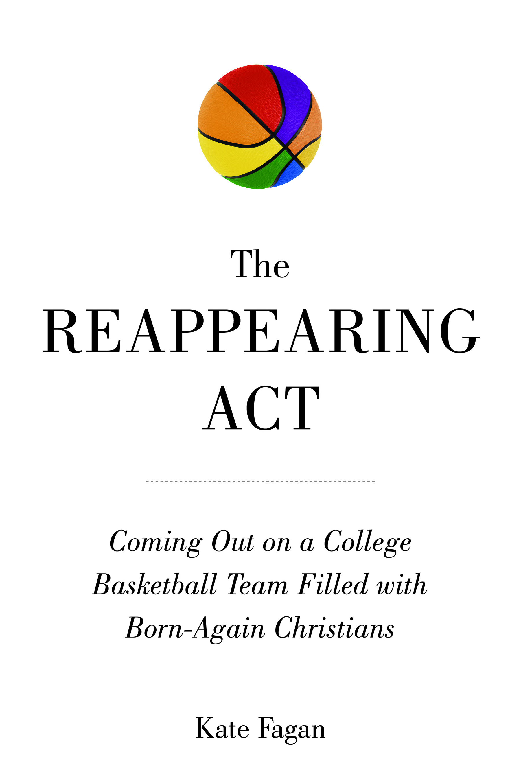
All of which is to say, I was anxious to see the initial cover design for my memoir, THE REAPPEARING ACT, when a copy of the design popped into my inbox one day last October. Along with the attached image was a note letting me know that because of a time crunch, the in-house team at Skyhorse Publishing had already approved this design to go into their sales catalog, which is what bookstores use as a guide for placing advance orders. I was walking down the street in Brooklyn, probably coming home from the coffee shop, when I opened the JPEG attachment on my phone and the image loaded and filled the screen. You can see that image—the rainbow-colored basketball—in the slideshow above, all the way to the right. (And yes, I'm about to explain the origin of the other nine designs you see here.)
So, how to explain how I felt about the rainbow ball? To confess that I almost started crying would not be hyperbolic. I felt like I needed someone to give me a long hug and tell me it would all be okay, that we would make it okay. My reaction is a tricky thing to explain, because I know that the rainbow flag has long been a powerful symbol in the LGBT community. But I also think it's a symbol that means more to an older generation than mine, and it's not one that I've ever felt any strong connection to, perhaps because I'm lucky enough to live during a time when the growing visibility and acceptance of gay people is the greatest symbol we have.
More to the point, I had written a coming-of-age memoir, and just like any writer—gay or straight—I wanted the story to have universal appeal. I never intended to write a "gay memoir" (whatever that means), and I felt strongly that the rainbow basketball did not represent what was on the pages. Simply put, it felt like a cliché, like we were pandering to a very specific audience. In the same way that gay athletes often feel like their stories are grossly simplified by dramatic headlines—"Joe Star comes out!"—I thought the rainbow ball offered little nuance or context.
I immediately (as in, right then and there on the street) emailed the folks at Skyhorse and asked if I could hire an outside designer. They said I could, but made no promises that they would use the cover designs we created. In the moment, that mattered little to me. It was a gamble I was willing to take.
Part of my anxiety stemmed from having read the misadventures—and, in some cases, horror stories—of other authors who ended up going to market with book titles and/or covers they disliked. (This essay by Deborah Copaken Kogan, specifically the part about her book SHUTTERBABE, vividly captures that angst.)
I found the designer Nim Ben-Reuven after an extensive Google search. I saw some of his work on Behance, then landed on his webpage: www.nimbenreuven.com. He had created an awesome mock redesign for THE WIND-UP BIRD CHRONICLES, as part of an online cover-design competition. I emailed him, and we met for coffee, quickly hitting it off and agreeing to collaborate. (I had an even better feeling about Nim after he read my book in just a few days.)
A month later, we met for coffee again, and Nim showed me his first three cover options for THE REAPPEARING ACT. You can see them above—first, second and third from the left. I loved Design No. 1 ("Ethereal Boulder" I called it) because it captured what life had felt like for me during my time at the University of Colorado. Only problem: No one else among my friends and family thought it made sense. Where is the sports angle? Why does it look like a religious book? They didn't think it was a quick read visually, which is key, of course, because a book cover only has a split-second to make an impression for potential buyers.
So Nim decided he would work on a design that merged No. 1 with No. 3 (the massive looming orange basketball). He said he would also come back with two other new designs—wild cards, just for fun, to give us something else to think about.
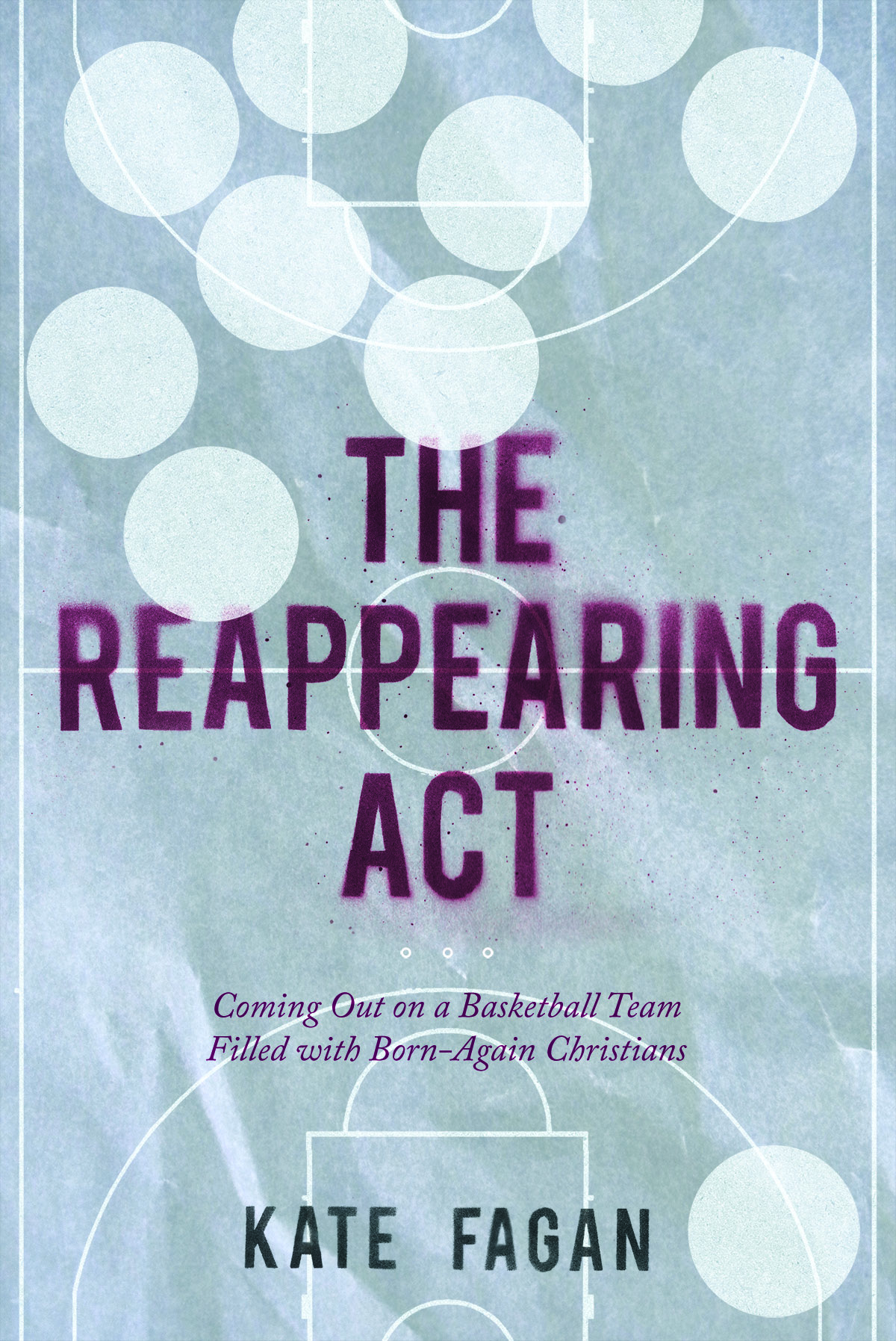
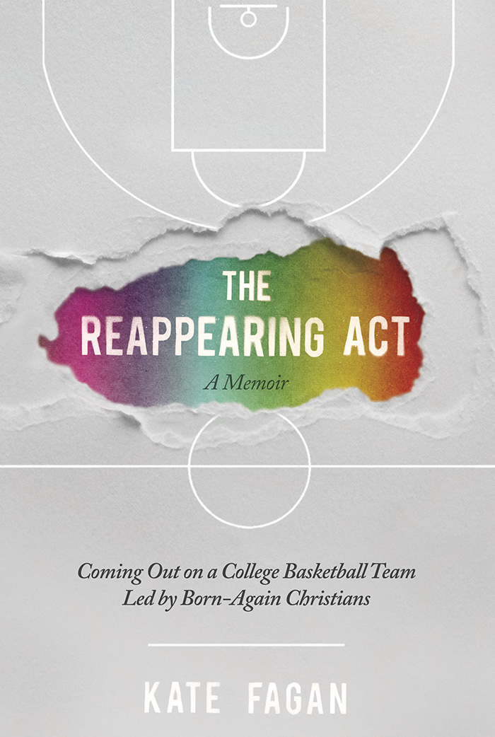
A few weeks later, we were back at a coffee shop, looking at printouts of three new designs: No. 4, No. 5 and No. 6 above (from left to right). I liked them all. The design of No. 4 had a clever use of dots—10 of them, just like players on a court, with one lone dot by my name. And in No. 6, the title coming through the torn paper was stylish and cool, a nod to the simple, clean design of THE GOLDFINCH.
But I was still committed to "Ethereal Boulder" (No. 5 above). So the next day, we sent that one to the team at Skyhorse, figuring they would love it the way we loved it.
They did not. The sales people felt strongly that the design was too localized; they said the mountain imagery might signal to the reader that this was a book meant for a regional audience. Also, and perhaps more important to them, there was nothing particularly gay about it. Apparently, and surprisingly, the rainbow basketball had done the trick in the advance sales catalog, and bookstores had committed to purchase a decent number of copies of THE REAPPEARING ACT. The sales team was worried that removing the rainbow would cause bookstores to downgrade their orders.
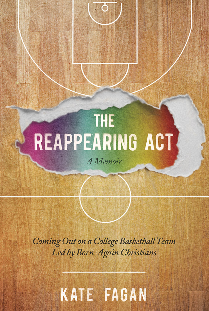
At that point, I set up an in-person meeting at the publisher's office. I then prepared for this meeting like a lawyer getting ready for closing arguments, with my bullet-point list of why we couldn't use the rainbow basketball as the final cover. In the meantime, Nim began designing a couple of options, No. 8 and No. 9 above, that included some form of a rainbow, in case we had to meet Skyhorse somewhere in the middle. He also came up with No. 7, a variation on No. 6 that I had asked to see.
My heart was hammering as I walked into the meeting with the sales director. (Picture me splashing water on my face in the bathroom beforehand, amping myself up.) One of the reasons I had written this book was because the women's basketball community is still uneasy about issues of sexuality, and I was hoping to shine a light on the damage done by all the closeting and fear that still exist for so many coaches and players even now, a decade after I finished college. I was also pretty sure that very few of them would be willing to buy the book (let alone carry it around and display it in their homes) if there was a rainbow basketball on the cover. Of course, all of this felt really complicated to explain to the sales team.
Regardless, I was ready for a debate. I had my pen in hand, my list of bullet points in front of me. The sales director, a man in his mid- to late-40s, explained why they had created the rainbow ball design, because it's a clear symbol for the gay community, one that people are proud of, etc … He had asked some of his gay friends about the use of the rainbow imagery, and they all felt strongly that it was the right way to go.
When it was my turn to speak, he basically just nodded at the envelope in my hand, the one with the printouts of the other design options, and asked me to put them on the table. I laid them all out, ready to launch into my defense. Then he looked at me and asked, "Which one do you want? We would never publish a cover that you don't want." (He did make it clear, though, that "Ethereal Boulder" was not in the mix -- don't even try.)
Instinctively, I pointed to the cover design with the hardwood court and the 10 white dots.
He picked it up and said, "Cool, we'll use this one." Then, two seconds later, he added, "Just include the words as gay after coming out. I think that will satisfy the buyers."
And with that, the meeting was over.
* * * *
In the world of sales, everything needs a label. People need to know where things fit, in what category, and for what audience. This is especially true in book publishing, where it's all about summarizing an entire story in one quick sentence: "The book is about aliens who can only drink Mountain Dew!"
Amazing! Sold!
It's not hard to understand why publishers often want covers that are simplified to the lowest common denominator. And I'm sure this feels perfectly okay in plenty of instances: a cookbook with a spatula on the cover, a gardening book with a flower on it; or, in the case of the hugely successful memoir Wild, a story of self-discovery illustrated with a single hiking boot. But it feels like we're in an in-between state when it comes to works by or about members of the LGBT community. Maybe 20 years ago you needed a clear symbol on the cover, because most readers of such a book were likely to be members of that community. Today, though, we're in a different place, with more and more people—from various walks of life—inclined to pick up a book that might offer a sense of what it's like to be gay, lesbian, transgender or anyone else who might identify as other.
And books that include LGBT themes need exactly what every other book needs: an eye-catching design.
In the end, I'm happy to say we all found common ground.
